User psychology principle UX designer should know (Part 2)
UX/UI
User psychology principle UX designer should know (Part 2)
In recent years UX/UI becomes a familiar phrase you see when designing user interface. Since the primary user is human the best way to create a smooth experience is to have a deep understanding of the user's habits, preferences, and behavioral trends. Psychology has an important role in designing the user experience because it helps the customer solve the right problem. I have assembled in multiple web like Law of UX and Human by Design with some other reliable references.
Part 2 of the series has compiled and simplified another 4 psychological principles that will help improve the aesthetics, effectiveness, and usability of your designs.
Fitt’s law
Von Restorff Effect
Pareto Principle
Miller’s law
Fitt’s Law
“The amount of time to move a pointer or mouse cursor to a target area is a function of the distance to the target and the size of the target.”
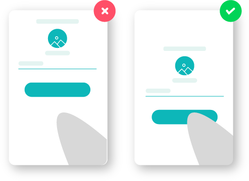
In 1954, psychologist Paul Morris Fitts Jr., examining a model of human movement, showed that the time required to rapidly move to a target depends on the ratio between the distance and width of the target. By his law, fast movements and small targets result in greater error rates, due to the speed-accuracy trade-off. Touch targets should be large enough for users to recognize what it is and to accurately select them.
User experience (UX) and user interface (UI) design all applied Fitts’ law. An interactive element, in the context of UI, can be anything, such as an input field in a web form, a submit button, or a hyperlink. The idea is this: The quicker you can reach a target object, the more convenient and easy it is to use. The Fitts’s law applies to the physical movement of the hand and the on-screen movement of the mouse pointer. The buttons on the mobile app interface will be larger than when designed on the desktop because our finger area (touch) is larger than the mouse pointer (click).
To boost UX with Fitts’ law, arrange important elements on your site in a way that makes it convenient for the user to reach them. As in the case of the Apple Macbook’s interface, although the button is fairly small in size, most users do not find it difficult. As explained, the mouse size is cover a very small area, we can completely click the buttons exactly. Bigger is not always better.
As in the case of the "To do" button here, you can see that the user does not need to use the mouse to point exactly to the text on the button, but only within the area of that text. Make a large interactive area, just like when you experience on checkbox, you can click anywhere in the text to check or uncheck it. When we make the text of a menu bar and the tabs clickable, increased its usability index.
The external edges and corners of the user interface can be acquired with a more prominent speed than anywhere else in the display, due to the pinning action of the screen. As the user is restricted in their movements the pointing device cannot move any further when they reach the outermost points of the screen; fixing the cursor at a point on the periphery of the display.
One more thing you need to note, the electronic screens are now rectangular, which suggests that the more we go to the four corners, the narrower the operating range of the mouse. So what does this mean in the user experience? Within the limits of a rectangle, moving the mouse pointer to the four corners of the corner is quicker than anywhere on the screen, so buttons or key interactions usually place in those positions. In the example below, the similarity in all websites is that important interaction areas like login, cart, notification, search, ... are all located in the right corner of the screen!
Von Restorff Effect
“When multiple similar objects are present, the one that differs from the rest is most likely to be remembered!”
The Isolation Effect (or the Von Restorff Effect) mentions that humans tend to memorize objects differently and stand out from their surrounding elements. Items that stand out from their peers by color, shape, position, size, and texture are more memorable. The theory was made by German psychiatrist and pediatrician Hedwig von Restorff in 1906-1962.
By playing with color and arrangement of elements on your website, you can process the memory of the product to the customer’s subconscious. A well-thought layout with subtle persuasive techniques in mind is the key to selling online. To put it in the words in eCommerce, make the button “proceed to payment” the most visible element during the checkout process. What kind of image do you want to make users recall the most when using your product? It’s simple, make them stand out from the rest of the design.
The other example is the call-to-actions (CTAs) have a different look than the rest of the normal action buttons on a site or application! For the users to have a clear understanding of what the CTA does, whilst also remembering it all the time they spend on the application or site.
But keep in mind that the Von Restorff principle must be used in moderation. Trying to make several things stand out can cause your users to become overwhelmed with all that is happening on the screen and lose focus.
Pareto Principle
“For many events, roughly 80% of the effects come from 20% of the causes.”
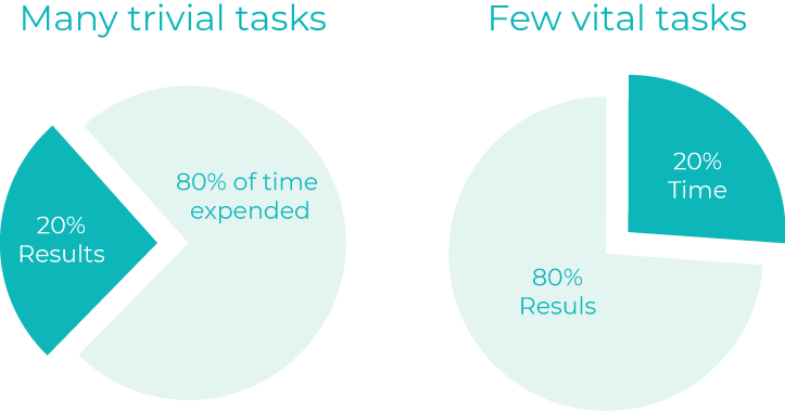
The Pareto principle (also known as the 80/20 rule) states that 80% of your outcomes come from 20% of your investments. Suggest by the Italian economist Vilfredo Pareto, who observed and found that 80% of the land in Italy is owned by 20% of the population. The Pareto principle in the long turn can help you save time and money. Those are two things that are always in need of any projects. For example, Microsoft notices that 80% of the errors and crashes related to the given system would be eliminated, by fixing the top 20% of the most-reported bugs.
This falls in line with the Miller’s principle. When people are starting to ask the same question. Are you struggling with too many tasks per day to be efficient? Are there too many tools your team was using to collaborate? Does your team have too many members? Are your new employees was overloaded with information, leading to confusion? Trying to do it all and perfect all your issues at once is overwhelming and gives little results. Prioritizing your efforts on the small vital tasks will help you work more effectively. The unavoidable truth is that you have limited assets to figure out a large sum of issues. Figure out what importance most, at that point contribute your time and effort into the key areas that will offer assistance to convey the most prominent impact.
Keep in mind that although you do want to focus on the main 20 percent variables in your design, it does not mean the remaining 80 percent of other factor is irrelevant. Where you have time and resources, refine all details to create the best user experience. A small number of the pages or content will hold the majority of user time; this doesn’t mean that the rest of the page or content is not important but it does mean that the majority of your users see some page and content is more important than some of the rest.
Miller’s law
“The average person can only keep seven, plus or minus two items in their working memory.”
How many words can you remember in your head when reading this.
For the vast majority of people, you only remember about 5-6 of the words. This is called a cognitive load, which is a term used to limit memory when people have to receive a large amount of information and need to process in a short time.
In 1956, The Magical Number Seven, Plus or Minus Two: Some Limits on Our Capacity for Processing Information paper was published in 1956 by the cognitive psychologist George A. Miller of Princeton University’s Department of Psychology in Psychological Review. It says that the number of ‘chunks’ an average human can absorb in their working memory (a component of short-term processed and stored memory) is 7 ± 2. This is called the Miller’s law.
When a user visits a website or an application, the brain is constantly active and spends a load of cognitive resources to process relevant information needed. If a user gets "hit" in the face with too many images at once, they will not be able to process and receive. That why less is more.
Chunking and grouping allow the brain to increase the channel capacity of the short term memory; however, each chunk must be meaningful to the objects.
A close example is the application of cell phone numbers. The number grouping content in a manageable way so that people can remember what number they want easily and quickly.
6615550176or661-555-0176
As a string of digits without spacing, an eleven-digit number is difficult for a user to hold in working memory. Add some spacing, however, and your users’ task is considerably eased. By chunking the information your user can retain the three groups of numbers in working memory, enabling them to complete their task.
By reducing the number of elements in your list — and keeping them organized by category chunks not exceeding 9 bits, your brain will be able to remember exactly where things are so you can access it effectively. For those who follow the minimalism, then rest assured, 5 chunks of information are the lowest level that users can receive, it is not necessarily to make things simpler than that.


